
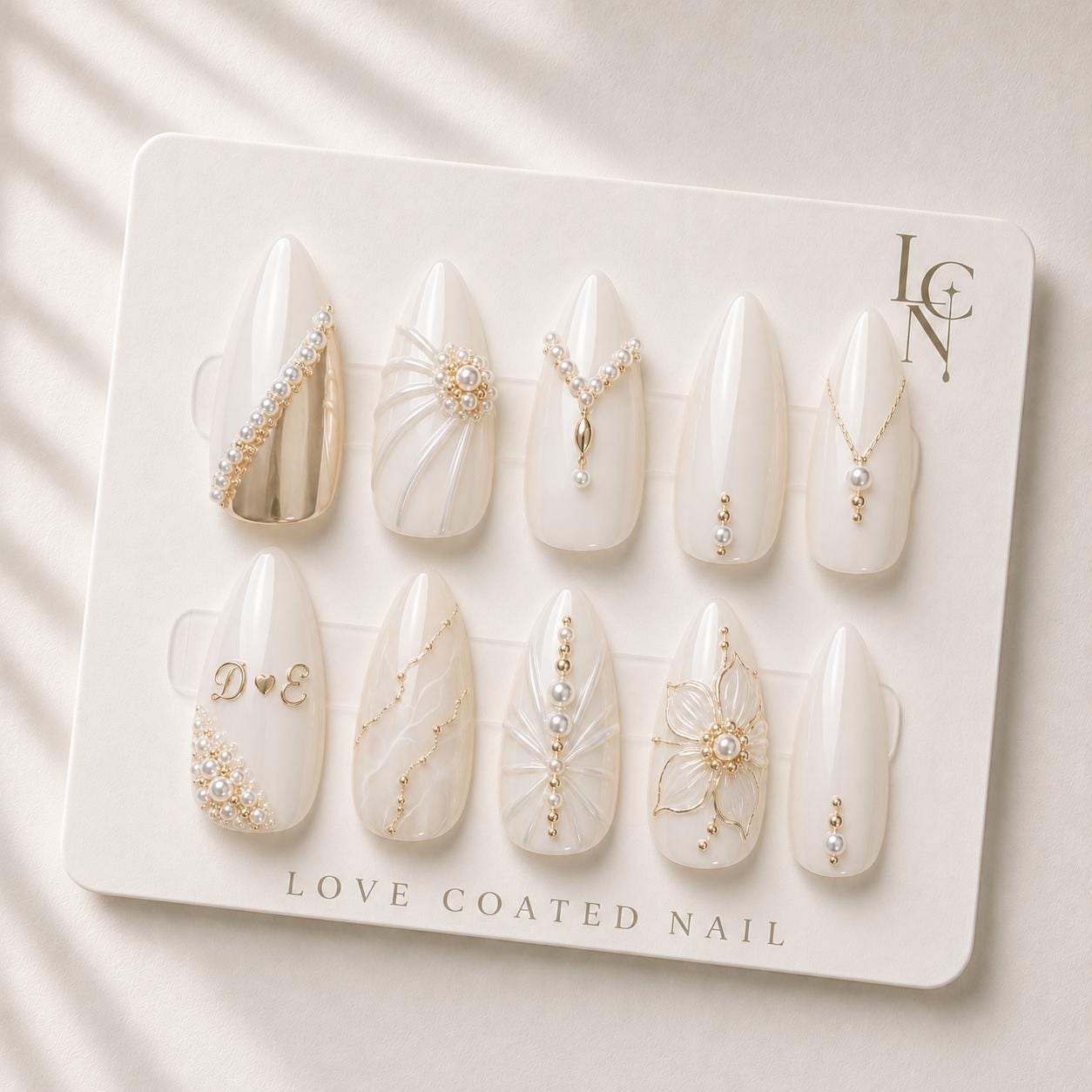
The most elegant personalized initial designs for luxury bridal press‑on nails combine a classic serif or delicate script font with a subtle placement that enhances the ivory and pearl aesthetic without overwhelming the overall look. A single initial in a thin gold‑filled serif, or a pair of intertwined initials in a soft script placed near the cuticle, creates a refined, meaningful detail that complements the bridal manicure.
Classic Serif Elegance
A thin, high‑contrast serif font such as Didot or Bodoni lends a timeless, architectural quality to the initials. When rendered in a muted gold or pearl‑infused finish, the letters sit just below the free edge, allowing the sculpted gel draping and pearl clusters to remain the focal point. This style works especially well with the medium almond shape of Love Coated Nail’s bridal set, as the elongated silhouette provides enough surface for the letters without crowding the nail tip. Pair the serif initials with a simple gold accent line or a tiny pearl dot to echo the jewelry‑inspired detailing of the rest of the design.
Delicate Script Flow
For a softer, romantic feel, choose a flowing script like Edwardian Script or a custom hand‑lettered style. The curves of the script echo the handcrafted floral artwork on the nails, creating visual harmony. Position the script initials slightly off‑center, toward the lunula, so the letters appear as a subtle whisper rather than a bold statement. This placement works beautifully with the marble‑inspired accents, allowing the script to sit within the natural veins of the marble pattern. A faint ivory outline around the script can add depth while maintaining the quiet‑luxury vibe.
Monogram Interlock
When both bride and groom’s initials are desired, an interlocking monogram offers a balanced, symmetrical look. Choose a geometric sans‑serif for a modern edge, or a classic serif for a vintage feel. The interlock should be compact, fitting within the width of the nail without extending onto the free edge. This design pairs nicely with the pearl clusters arranged in a linear cascade, as the monogram can sit just above the first row of pearls, creating a tiered effect that feels intentional and elegant.
Minimalist Initials Only
Sometimes less is more. A single initial rendered in a matte ivory finish, without additional embellishment, can be striking when the nail itself already features intricate details like 3D gel draping or hand‑sculpted floral motifs. The minimalist approach lets the personalized touch speak softly, while the surrounding design elements—gold detailing, marble accents—provide the visual interest. This style is ideal for brides who prefer a clean, understated look that still carries personal meaning.
Placement and Proportion Tips
Regardless of font choice, the proportion of the initials to the nail surface is crucial. Aim for the letters to occupy no more than one‑third of the nail width, leaving ample space for the pearl and gold accents. Center the initials vertically between the cuticle and the free edge, but consider a slight offset toward the cuticle for a more delicate appearance. Test the design on a mock‑up or a digital template before finalizing the personalization to ensure the letters are legible and harmonious with the overall aesthetic.