
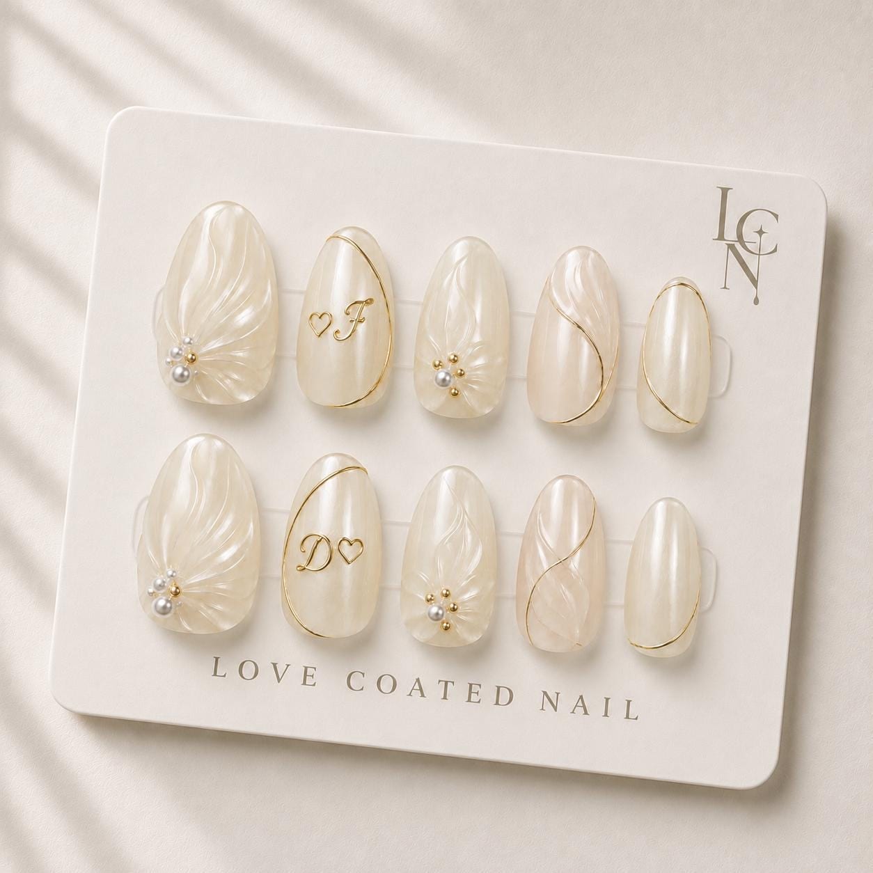
Which personalized initial monogram style looks most elegant on luxury bridal press‑on nails? For most brides, a classic serif monogram with intertwined letters, centered on the nail and accented with a thin champagne gold chrome line, provides the most timeless and sophisticated appearance. The clean strokes of a serif font echo traditional wedding stationery, while the subtle gold accent ties the nail design to the bridal palette without overwhelming the pearl‑infused mother‑of‑pearl base.
Classic Serif vs. Flowing Script
Serif fonts such as Times New Roman or Garamond bring a sense of formality and balance. Their defined serifs create tiny visual anchors that read well even at the miniature scale of a press‑on nail. When paired with the soft ivory shimmer of Love Coated Nail’s bridal set, the serif initial stands out as a crisp, elegant focal point. In contrast, a flowing script like Edwardian Script or Bickham Script adds romance through sweeping curves, but the fine lines can become difficult to discern on a 10‑mm almond nail, especially if the nail is coated with a glossy finish. Script works best when the letters are slightly enlarged and placed lower on the nail, allowing the natural curvature of the hand to complement the design. However, for a universally elegant look that translates across lighting conditions and photography styles, the classic serif remains the safest choice.
Single Initial vs. Intertwined Layout
Many brides consider whether to display a single initial—often the bride’s own—or an intertwined monogram that combines both partners’ letters. A single initial placed in the center of each nail offers a minimalist aesthetic and reduces the risk of visual clutter. This approach works well when the nail already features decorative elements such as 3D gel pearls or gold chrome vines. An intertwined layout, where the two letters overlap or are linked by a subtle heart or vine, adds a personal narrative to the manicure. The key to elegance here is restraint: the letters should be proportionally balanced, with the overlap occurring at the apex of the letters rather than a full overlay that obscures shape. The Love Coated Nail set’s medium almond shape provides enough surface area for a modestly sized intertwined monogram without compromising the integrity of the pearl embellishments.
Placement and Size Relative to Nail Shape
The almond shape of the bridal press‑on nails offers a natural elongation that guides the eye from the cuticle to the fingertip. Positioning the monogram slightly above the nail’s midpoint aligns the design with the nail’s longest axis, creating a harmonious visual flow. If the monogram is too low, it can clash with the natural curve of the fingertip and appear cramped; too high and it may be hidden by a wedding ring. A height that occupies roughly one‑third of the nail’s visible surface ensures readability while preserving space for the surrounding gold chrome accents. Scaling the letters to about 4‑5 mm in height maintains legibility without overwhelming the delicate pearl texture that defines the Love Coated Nail collection.