
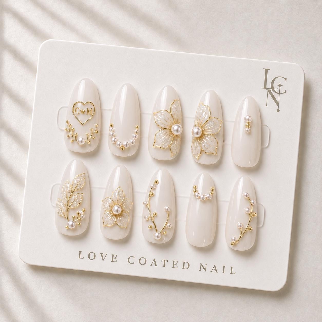
Choosing the right initial monogram for your wedding press‑on nails begins with matching the style of the letters to the overall aesthetic of your wedding stationery and décor. Look for a font that echoes the typography of your invitations, save‑the‑dates, or wedding logo, and consider how the size and placement will sit on the soft ivory base of the nail set.
Identify Your Wedding Typography
Start by pulling a copy of your invitation suite or any printed material that carries the primary typeface for your celebration. If you have a classic serif script on your invitations, a similar elegant script works well for the monogram on your nails. For modern minimalist weddings that use a clean sans‑serif, a simple, thin sans‑serif monogram will feel cohesive. Take note of the weight of the letters – bold lettering can look striking on a small nail surface, while ultra‑light scripts may become difficult to read.
Decide Between Single Initials, Dual Initials, or a Heart‑Shaped Monogram
Love Coated Nail offers three personalization options: a single initial, a combined monogram with both partners’ initials (for example, C♡M), or a custom arrangement. A single initial creates a subtle, understated look that pairs nicely with delicate pearl and gold details. A dual monogram adds a romantic statement and works especially well when the letters are interlocked or linked with a small heart, echoing the motif of many wedding invitations. If your stationery features a decorative ampersand or a unique flourish, you might ask the studio to incorporate that element into the nail monogram for a truly bespoke touch.
Choose a Font Style That Complements Your Nail Details
The bridal press‑on nails from Love Coated Nail feature 3D floral artwork, pearl embellishments, and fine gold botanical accents. To avoid visual competition, select a monogram font that is either slightly lighter than the floral details or that shares a similar line quality. For example, a classic calligraphic script with subtle swashes will echo the curves of the translucent flower petals without overwhelming them. Conversely, a geometric sans‑serif can provide a clean contrast to the organic floral elements, creating a balanced visual hierarchy.
Consider Size, Placement, and Spacing
Because the nail surface is limited, the monogram should be sized proportionally to the nail length you plan to wear. A short almond or oval shape offers a broader canvas for a larger monogram, while a coffin shape may require a more compact arrangement. Position the initials centrally for a classic look, or offset them toward the cuticle edge if you want the monogram to peek out from under a lace cuff or a pearl‑adorned bracelet. Keep spacing between letters tight enough to read as a single unit, but not so cramped that the details blur.
Test the Look with a Mock‑up
Before finalizing your order, create a simple mock‑up using a word processor or design app. Print the monogram in the chosen font at the approximate size of a nail tip (about 1‑1.5 cm tall) and place it on a photo of the ivory nail base. This visual test helps you see how the letters interact with the pearl and gold accents and whether the contrast is sufficient. If the monogram feels too busy, try a lighter weight of the same font or reduce the decorative flourishes.