
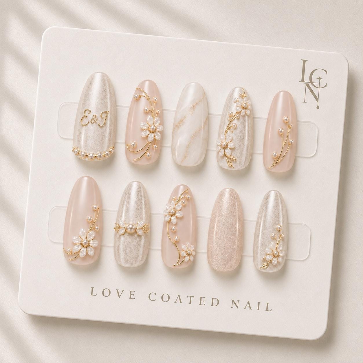
Choosing the perfect personalized initial style for bridal press‑on nails begins with matching the monogram to your wedding’s visual language. Look at your invitation typography, color palette, and any emblematic motifs—whether a classic script, a modern sans‑serif, or a heart‑shaped monogram. Select an initial design that mirrors those elements so the nails become a subtle extension of your overall aesthetic.
Aligning Initials with Your Wedding Theme
A garden wedding often features soft blush, ivory, and botanical details. In that context, a delicate cursive initial in a muted gold or pearl finish will echo the floral arrangements and lace accents. For a sleek, black‑tie affair, a bold, block‑letter initial rendered in a high‑contrast metallic—such as gold chrome gel—creates a striking yet refined statement. Consider the scale of the initial as well; a larger, centered monogram works well on longer nail shapes, while a smaller, offset initial can be paired with a subtle daisy‑petal accent for a more understated look.
Choosing the Right Font and Symbolism
Your initials can be presented in pure letters, a heart‑shaped connector, or an intertwined monogram. If your wedding invitation uses a heart motif, incorporating a heart between the letters (e.g., E♡J) reinforces the romantic narrative. When the ceremony leans toward classic elegance, a serif font with subtle flourishes adds timeless charm. Avoid overly decorative fonts that may become illegible at the nail scale; instead, opt for clean lines that retain clarity when reduced to a few millimeters.
Coordinating Colors and Finishes
The color of the initial should harmonize with the nail’s base shade. Love Coated Nail’s bridal press‑on set offers a soft blush ivory base with a luminous pearl shimmer. A gold botanical vine detail pairs naturally with a gold‑toned initial, while a silver or pearl‑filled initial can complement cooler tones. If your dress features pearl accents, a pearl‑filled initial adds a cohesive sparkle without competing with the gown’s embellishments.
Balancing Placement and Nail Shape
The placement of the initial on the nail surface influences both visual impact and comfort. For almond or oval shapes, centering the initial works well, allowing the design to sit within the natural curve of the nail. On coffin or stiletto shapes, positioning the initial slightly toward the cuticle edge creates a balanced look, leaving the tip free for additional details like a tiny 3D flower charm. Keep in mind that larger initials may feel heavier on shorter nails, so adjust the size proportionally.
Practical Application Tips for a Flawless Finish
Before applying your personalized press‑ons, ensure the natural nail surface is clean and lightly buffed. Use the included adhesive tabs for the ceremony to avoid glue‑related sensitivities, then switch to nail glue for the reception if longer wear is desired. Align the initial design with the cuticle edge to prevent shifting during the day. After placement, gently press each nail for a few seconds to secure the bond, and finish with a light top coat if extra shine is desired. Proper removal with the provided alcohol prep pads helps preserve the integrity of the custom initials for future reuse.